- Posted on
- • Crafting Basics
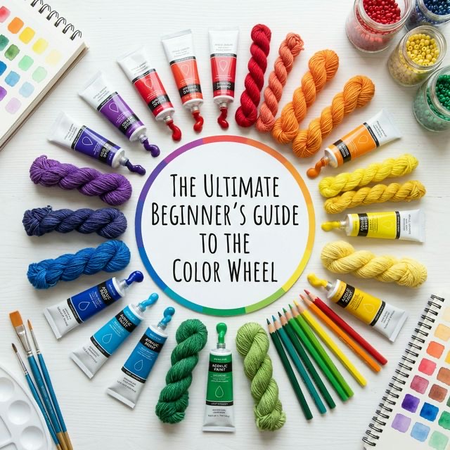
The Ultimate Beginner's Guide to the Color Wheel
- Author
-
-

- User
- C&C Admin
- Posts by this author
- Posts by this author
-
Have you ever stared at a blank canvas, a wall of yarn, or a collection of scrapbook papers and felt completely paralyzed by the sheer number of color choices? You are not alone. Choosing the right colors is often the most intimidating part of any creative project. But what if you had a simple, visual map that told you exactly which colors belong together and why? That map exists. It is called the color wheel.
Whether you are painting a sunset, knitting a cozy winter scarf, redecorating your living room, or designing a greeting card, the color wheel is your ultimate cheat sheet. It takes the guesswork out of creativity and replaces it with reliable, easy-to-understand science. You do not need an art degree to master it. You just need to understand a few basic rules.
In this comprehensive guide, we are going to break down the color wheel from the inside out. We will explore how it was invented, unravel the mysteries of primary, secondary, and tertiary colors, and show you how to use proven color harmonies to make your next crafting project absolutely stunning. Let’s dive into the colorful world of color theory!
1. What Exactly is the Color Wheel?
At its core, the color wheel is a circular diagram that organizes colors based on their relationships to one another. Imagine taking a rainbow, bending it into a complete circle, and connecting the red end to the violet end. That is the quickest way to understand what the color wheel looks like.
But the color wheel is much more than just a pretty rainbow circle. It is a mathematical and scientific tool used by artists, designers, and crafters to understand how colors mix, contrast, and harmonize. It shows you which colors are opposites, which colors are neighbors, and how combining different colors will yield completely new results.
A Brief History of the Wheel
The color wheel we use today wasn't just invented overnight. Its origins date back to the 1660s when the famous scientist Sir Isaac Newton conducted his groundbreaking experiments with light and prisms. When Newton shone white sunlight through a glass prism, he discovered that light split into a continuous spectrum of colors: red, orange, yellow, green, blue, indigo, and violet.
Newton realized that this spectrum wasn't just a straight line. The red from one end naturally seemed to fade back into the violet from the other end. So, he took the straight line of colors and wrapped it into a circle, creating the very first color wheel. Over the centuries, artists and theorists like Johann Wolfgang von Goethe and Johannes Itten refined Newton's scientific wheel perfectly into the tool that painters and crafters use today.
2. The Three Tiers of the Color Wheel
To truly understand how the color wheel works, you need to break it down into its three fundamental layers: primary colors, secondary colors, and tertiary colors. Think of these tiers as the building blocks of all visual art.
Tier 1: The Primary Colors
The primary colors are the absolute foundation of the color wheel. You can think of them as the "parents" of every other color. In traditional art and crafting—such as working with paint, yarn, or clay—the three primary colors are: * Red * Yellow * Blue
What makes primary colors so special? You cannot create primary colors by mixing other colors together. They exist entirely on their own. However, by mixing these three primary colors in different amounts, you can create almost every other color imaginable.
Tier 2: The Secondary Colors
If the primary colors are the parents, the secondary colors are the children. You create a secondary color by mixing two primary colors together in equal parts. There are exactly three secondary colors on the standard color wheel: * Orange: Created by mixing Red + Yellow. * Green: Created by mixing Yellow + Blue. * Purple (Violet): Created by mixing Blue + Red.
On the color wheel, you will always find the secondary color sitting exactly halfway between the two primary colors used to make it. For example, green sits right between yellow and blue.
Tier 3: The Tertiary Colors
Now we get to the grandchildren of the color wheel. Tertiary colors (sometimes called intermediate colors) are created by mixing one primary color with an equal part of one of its neighboring secondary colors.
Because tertiary colors are a mix of two different names, their titles are usually hyphenated. The primary color is always listed first. There are six tertiary colors: * Red-Orange: A fiery, warm shade. * Yellow-Orange: A golden, sunny hue. * Yellow-Green: A bright, spring-like chartreuse. * Blue-Green: A deep, aquatic teal or turquoise. * Blue-Purple: A rich, royal indigo. * Red-Purple: A vibrant magenta or fuchsia.
When you put all three tiers together (3 primary + 3 secondary + 6 tertiary), you get the standard 12-part color wheel. This is the most common wheel used in classrooms, art studios, and craft rooms around the world.
3. Core Properties: Hue, Value, and Intensity
Looking at a standard 12-part color wheel, you might wonder: "What about pink, brown, navy, or pastel blue? Where do they fit?" To understand how those colors are created, you need to look beyond the basic wheel and understand the three core properties of color: hue, value, and intensity.
Hue
"Hue" is simply the fancy, technical term for the name of the color itself. When you point at the color wheel and say "red" or "blue-green," you are identifying the hue. The 12 colors on the standard color wheel are pure hues. They contain no black, no white, and no grey.
Value: Tints, Shades, and Tones
Value refers to how light or dark a color is. By changing the value of a pure hue, you can unlock thousands of different colors. You change a color's value by adding neutral colors (white, black, or grey) to it.
- Tints (Adding White): A tint is created when you add pure white to a hue. Tints are lighter, softer, and more pastel than the original color. For example, adding white to red creates the tint we call pink. Adding white to blue creates pastel baby blue.
- Shades (Adding Black): A shade is created when you add pure black to a hue. Shades are darker, deeper, and richer. For example, adding black to red creates a dark maroon or burgundy. Adding black to blue creates deep navy.
- Tones (Adding Grey): A tone is created when you add grey (a mix of black and white) to a hue. Tones are more muted and less vibrant than pure hues. They often look more sophisticated, earthy, or vintage.
Intensity (Chroma or Saturation)
Intensity refers to the brightness or dullness of a color. A color at its highest intensity is incredibly bold, vibrant, and eye-catching (like a bright neon yellow). A color at a low intensity is washed out, dull, and subtle. You can lower the intensity of a color by adding its direct opposite from the color wheel, a trick we will explore when we talk about complementary colors.
4. Color Temperature: The Great Divide
If you draw a straight line directly down the middle of the color wheel—chopping it in half between the yellow-greens and the red-purples—you will discover one of the most important concepts in art: Color Temperature.
Colors have a psychological temperature. They make us feel different things simply by looking at them. The wheel is split evenly into two distinct families: warm colors and cool colors.
Warm Colors
Warm colors include reds, oranges, and yellows. As the name suggests, these colors remind us of heat, sunshine, fire, and glowing embers. * The feeling: Warm colors are energetic, loud, aggressive, and highly visible. They command attention. * The visual trick: Warm colors appear to advance or jump forward in space. If you paint a wall red, the room will visually feel smaller and cozier. If you knit a red flower on a sweater, it will pop out immediately.
Cool Colors
Cool colors include greens, blues, and purples. These colors remind us of cool water, lush forests, winter ice, and twilight skies. * The feeling: Cool colors are calming, soothing, relaxing, and quiet. They help reduce stress and create a sense of peace. * The visual trick: Cool colors appear to recede or drop back into space. If you paint a room light blue, it will visually feel larger and more open. In a landscape painting, distant mountains are almost always painted in cool, bluish-purple hues to make them look far away.
When you mix warm and cool colors together in a single craft project, you create a powerful visual contrast that instantly grabs the viewer's eye.
5. Classic Color Harmonies: How to Match Colors Perfectly
Knowing how the color wheel is built is great, but how do you actually use it to make beautiful things? This is where Color Harmonies (also known as Color Schemes) come in.
Color harmonies are proven, mathematical formulas for picking colors that look fantastic together. Whenever you are stuck trying to pick out yarn for a blanket or paper for a scrapbook, just spin the color wheel and use one of these four classic harmonies.
1. Monochromatic Harmony (The Single-Color Scheme)
"Mono" means one, and "chroma" means color. A monochromatic scheme uses just one single hue from the color wheel, but it uses many different tints, tones, and shades of that single hue. * Example: Using navy blue, royal blue, sky blue, and pastel baby blue together in one project. * Why it works: It is incredibly safe and guaranteed to look cohesive. It is deeply soothing because the eye doesn't have to process conflicting color signals. It is perfect for elegant, modern, and high-end designs.
2. Analogous Harmony (The Neighborhood Scheme)
An analogous scheme uses two, three, or four colors that are sitting right next to each other on the color wheel. * Example: Yellow, Yellow-Green, and Green. * Why it works: Because these colors are neighbors, they share similar undertones and blend beautifully without clashing. Analogous schemes are very common in nature (think of the varying yellows, oranges, and reds in autumn leaves). * Pro-Tip: To make an analogous scheme work perfectly, choose one color to be the dominating "boss" color, and use the other two only for minor accents.
3. Complementary Harmony (The Opposites Scheme)
A complementary scheme uses two colors that are directly across from each other on the color wheel. * Example: Red and Green; Blue and Orange; Yellow and Purple. * Why it works: Opposites attract! These pairings create the maximum amount of visual contrast possible. When you put blue right next to orange, the blue looks bluer, and the orange looks oranger. They vibrate with energy. * Pro-Tip: Complementary colors are so bold that they can hurt your eyes if used equally. It is best to use one color mostly as a background (like a soft, muted blue wall) and the opposite color as a tiny pop of brightness (like a bright orange throw pillow).
4. Triadic Harmony (The Triangle Scheme)
A triadic scheme uses three colors that are evenly spaced around the color wheel, forming a perfect triangle. * Example: The three primary colors (Red, Yellow, Blue) or the three secondary colors (Orange, Green, Purple). * Why it works: Triadic schemes are incredibly vibrant, playful, and balanced. Even if you use very pale pastel versions of the colors, a triadic scheme will always retain a lively, energetic feel. This scheme is extremely popular in children's toys, comic books, and joyful, vibrant crafts.
6. Practical Applications in Everyday Crafting
Now that you are armed with the science of the color wheel, how do you apply it to your actual crafting desk? Let's take a look at how color theory changes the game in three popular crafting hobbies.
In Painting and Mixed Media
In painting, the color wheel is your survival guide to mixing. Have you ever tried to mix a bright purple, only to end up with a muddy, disgusting brown? That happens when you accidentally mix all three primary colors together. If you want bright, pure colors, you have to keep your mixes clean. By looking at the color wheel, you know that mixing Yellow and Purple (opposites) will lower the intensity and eventually create mud. But mixing Yellow and Yellow-Orange (neighbors) will keep things bright and clean.
In Yarn Crafts and Textiles
When crocheting an afghan, quilting a blanket, or weaving a wall hanging, your colors tell a story. If your goal is to make a cozy, calming blanket for a nursery, the color wheel tells you to use a Monochromatic or Analogous scheme using Cool Colors (like soft mint greens and pale blues). If you want to make a retro, eye-catching throw pillow for a funky living room, the color wheel tells you to use a bold Triadic scheme (like mustard yellow, teal blue, and magenta).
In Paper Crafting and Scrapbooking
In paper crafts, contrast is everything. If you are making a greeting card and you want the happy birthday message to pop right off the paper, use a Complementary harmony. If the background of your card is a sweeping blue watercolor wash, sticking a bold, bright orange sentiment right in the middle will ensure it catches the viewer's eye immediately.
7. Common Pitfalls and How to Avoid Them
Even with the color wheel in hand, beginners often make a few common mistakes. Here is how to navigate the pitfalls of color design:
- Mistake 1: Using Too Many Colors It is easy to get excited and throw every color of the rainbow into a single project. However, using too many competing hues without a plan leads to visual chaos. The Fix: Limit your palette. Stick to a classic harmony (like 3 analogous colors) and strictly rely on neutral greys, whites, and blacks to fill in the rest of the space.
- Mistake 2: Ignoring Value Contrast Sometimes you pick a beautiful red and a gorgeous green, but when you put them together, your design looks flat and mushy. This happens when both colors have the exact same value (darkness/lightness). The Fix: Ensure there is high value contrast. Pair a very dark shade of green with a very pale tint of pink. This ensures your design is readable and dynamic.
- Mistake 3: Forgetting About Lighting The lighting in your room dramatically changes how colors look. A purple yarn that looks beautiful under the fluorescent lights of a craft store might look completely brown and muddy under the soft, yellow light bulbs in your living room. The Fix: Always view your color palettes under the lighting where the final project will be displayed. If it is a painting for a sunny kitchen window, test the colors in natural daylight.
Conclusion
The color wheel is not just a poster that hangs in an elementary school art room. It is a powerful, scientific tool that instantly elevates your crafting from amateur to professional. By understanding the relationships between primary, secondary, and tertiary colors, you gain total control over your artistic vision.
The next time you are standing in the craft store feeling overwhelmed by the endless aisles of paint, paper, and yarn, just take a deep breath. Visualize the color wheel. Pick a harmony, trust the science, and watch as your creative projects come to life with perfect, beautiful balance.