- Posted on
- • Crafting Basics
Primary, Secondary, and Tertiary Colors Explained
- Author
-
-

- User
- C&C Admin
- Posts by this author
- Posts by this author
-
Have you ever looked at a breathtaking painting, a brilliantly designed quilt, or a striking graphic design and wondered how the artist chose such perfect colors? It can feel like magic, but the truth is much more logical. Behind every beautiful color palette is a strict, mathematical system known as color theory. And at the very foundation of that system are the three tiers of color: primary, secondary, and tertiary.
Whether you are mixing acrylic paints on a palette, dying your own yarn, or picking out cardstock for a scrapbook, understanding these three levels of color is the first step to mastering your craft. By learning the rules of how colors are born, how they parent new colors, and how they relate to one another, you will never have to guess when choosing a color palette again.
Let's break down the science of color mixing, exploring the primary, secondary, and tertiary colors, and discover how to use them to elevate your creative projects.
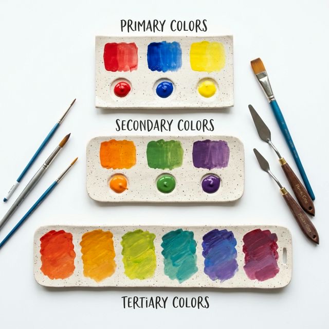
1. The Foundation: Primary Colors
If the color wheel were a massive family tree, the primary colors would be the great-grandparents. They are the absolute starting point for all other colors in the traditional art world.
In the classic RYB (Red, Yellow, Blue) color model—the model used by painters, crafters, and artists for centuries—there are exactly three primary colors: * Red * Yellow * Blue
The Golden Rule of Primary Colors
There is one massive, unbreakable rule when it comes to primary colors: You cannot create a primary color by mixing two other colors together.
For example, if you run out of blue paint, you cannot just mix green and purple together to get more blue. Blue must exist independently. You have to buy it from the store. This is because primary colors are theoretically pure; they contain no traces of any other hues.
However, the magic of primary colors lies in their power. While you cannot mix them, you can use them to mix almost every other color in existence. If you were stranded on a desert island and could only take three tubes of paint, red, yellow, and blue would be your lifelines.
The Psychology of Primary Colors
Because they are so pure and untethered, primary colors carry a lot of psychological weight. * Red: Screams energy, passion, urgency, and power. Think of stop signs or fire engines. * Yellow: Radiates joy, sunshine, optimism, and warmth. It is the color of sunflowers and smiley faces. * Blue: Evokes calm, trust, stability, and intelligence. It represents the endless ocean and the clear sky.
When you use all three primary colors together in a single project (known as a primary triadic harmony), the result is incredibly vibrant, playful, and energetic. This is exactly why children's toys and comic books almost exclusively use bright reds, yellows, and blues!
2. The Second Generation: Secondary Colors
Once you have your three primary colors securely on your palette, you are ready to start mixing. If you take two primary colors and mix them together in perfectly equal parts, you will give birth to the second generation: the secondary colors.
Like the primary colors, there are exactly three secondary colors on the standard color wheel: * Orange: Born from mixing Red + Yellow. * Green: Born from mixing Yellow + Blue. * Purple (Violet): Born from mixing Blue + Red.
Finding Secondary Colors on the Wheel
If you look at a traditional 12-part color wheel, the placement of the secondary colors makes perfect logical sense. Each secondary color sits exactly halfway between the two primary colors that created it.
Green sits squarely between yellow and blue. Orange bridges the gap between red and yellow. Purple connects the cool blue to the fiery red. This halfway point is crucial. For a color to be considered a true secondary color, it must be a 50/50 balance. If an orange leans too far toward red, it is no longer a true secondary color (we'll cover what it becomes in the next section!).
Mixing Secondary Colors in the Real World
While the math says that mixing 50% red and 50% yellow creates a perfect orange, the real world of crafting is a bit messier.
Different brands of paint, ink, and dye have different chemical pigments. Some blue paints might have tiny, hidden traces of yellow in them. If you mix that specific blue with red to make purple, that hidden yellow will contaminate the mix, resulting in a muddy, brownish purple instead of a bright royal violet.
- Pro-Tip for Crafters: When trying to mix perfectly clean secondary colors, always check the label on your paint or dye. Look for "pure" pigments. The less ingredients listed on the back of the tube, the cleaner your secondary colors will be!
3. The Details: Tertiary Colors
We have the parents (primary) and the children (secondary). Now we reach the grandchildren of the color wheel: the tertiary colors. Sometimes called intermediate colors, tertiary colors are where the color wheel starts to look incredibly complex, beautiful, and realistic.
A tertiary color is created by mixing one primary color with one of the secondary colors sitting directly next to it on the color wheel. Because you are mixing a primary element with a secondary element, the naming convention for tertiary colors is always hyphenated. The primary color's name always goes first.
There are six distinct tertiary colors on the standard 12-part wheel: 1. Red-Orange: A fiery, blazing vermilion. (Red + Orange) 2. Yellow-Orange: A bright, golden marigold or amber. (Yellow + Orange) 3. Yellow-Green: A zesty, spring-like chartreuse. (Yellow + Green) 4. Blue-Green: A cool, aquatic teal or turquoise. (Blue + Green) 5. Blue-Purple: A deep, royal indigo. (Blue + Purple) 6. Red-Purple: A vibrant magenta, fuchsia, or wine color. (Red + Purple)
Bridging the Gaps
Tertiary colors are the glue that holds the color wheel together. They bridge the gap between the bold, stark contrasts of the primary and secondary colors.
For example, jumping straight from pure yellow to pure green can feel harsh and jarring. But if you ease the transition by placing yellow-green between them, the viewer's eye glides smoothly from one shade to the next. This makes tertiary colors essential for creating smooth gradients, realistic shading, and natural-looking transitions in your art.
The Problem With "Mud"
When dealing with tertiary colors, many beginners make a fatal mistake: they try to mix a primary color with a secondary color that is not right next to it.
For example, what happens if you try to make a new tertiary color by mixing Red (a primary) and Green (a secondary)? According to the wheel, Red and Green are sitting on completely opposite sides. Because green is made of blue and yellow, mixing red into it means you are mixing all three primary colors together (Red + Blue + Yellow). When all three primary colors crash together, they cancel each other out, creating brown, grey, or black. This is called creating "mud."
Tertiary colors only happen when you mix a primary color with its next-door neighbor!
4. How to Use the Three Tiers in Your Crafts
Understanding the difference between primary, secondary, and tertiary colors is useless unless you know how to apply that knowledge to your actual projects. Here are three ways to use this science at your crafting desk:
1. Creating Balance with Triadic Color Schemes
The standard color wheel is built on triangles. The three primary colors form a perfectly spaced triangle. The three secondary colors form a perfectly spaced triangle. The tertiary colors form two overlapping triangles.
If you want a bold, balanced, and energetic look for a quilt, a scrapbook page, or a room design, use a Triadic Color Scheme. Simply pick three colors that form a triangle. * Example: Pair teal (blue-green), magenta (red-purple), and amber (yellow-orange). Because these three tertiary colors are evenly spaced, they provide incredibly dynamic contrast without clashing.
2. Highlighting with Primary Colors
Because primary colors are so pure, they immediately draw the viewer's eye. If you have a craft project that uses mostly soft tertiary colors (like a muted, earthy landscape painting full of yellow-greens and blue-purples), you can use a tiny drop of a primary color to create a focal point. Paint a single, bright primary red boat in the middle of that painting, and the viewer will instantly look exactly where you want them to.
3. Mixing Custom Colors on a Budget
Crafting supplies can be expensive. You do not need to buy 50 different tubes of paint or 50 distinct markers to have a complete palette. If you understand the three tiers of color, you only need to invest heavily in high-quality primary colors. By mastering the art of mixing, you can create the secondary oranges and greens, and the tertiary teals and vermilions, entirely from scratch. This saves you money and guarantees that all the colors in your project belong to the same harmonic family.
Conclusion
The color wheel is vastly more than just a circular rainbow; it is a meticulously organized map of relationships. By understanding the three tiers of color, you unlock the secrets of visual design.
You now know that the powerful primary colors (red, yellow, and blue) are the unbreakable foundation. The secondary colors (orange, green, and purple) are the beautiful, balanced offspring. And the tertiary colors (the hyphenated hues) are the intricate details that make gradients and transitions smooth and realistic.
Armed with this knowledge, you can approach your next painting, sewing project, or room makeover with the confidence of a professional artist. Stop guessing, start mixing, and let the science of the color wheel guide your creativity!