- Posted on
- • Crafting Basics
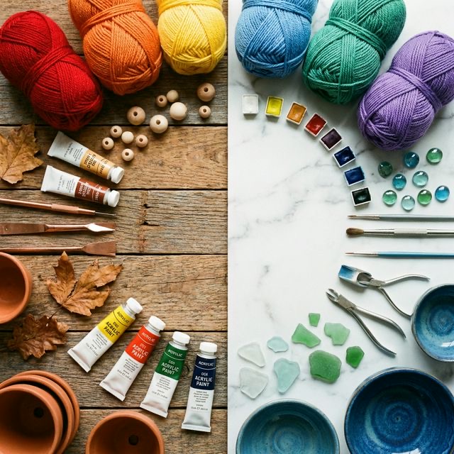
Warm vs. Cool Colors: How to Use Them in Your Projects
- Author
-
-

- User
- C&C Admin
- Posts by this author
- Posts by this author
-
Have you ever walked into a room and immediately felt energized and awake? Or conversely, have you ever stepped into a spa or a bedroom and instantly felt a wave of calm wash over you? While lighting, furniture, and sound all play a role, the biggest subconscious trigger for those feelings was almost certainly color. Specifically: color temperature.
Every color on the color wheel has a psychological temperature. Just like the thermostat in your house, you can turn the visual temperature of your crafts up to make them hot, loud, and energetic, or turn it down to make them cool, quiet, and relaxing.
Understanding the difference between warm and cool colors—and knowing how to balance them against each other—is one of the most powerful tools a crafter can possess. Whether you are knitting a sweater, designing a logo, or redecorating a living room, mastering color temperature will completely change how people react to your work. Let’s dive into the fascinating world of warm and cool colors!
1. The Great Divide: Splitting the Color Wheel
To understand color temperature, you need to look at a standard 12-part color wheel. Imagine drawing a straight line directly down the middle of the wheel, cutting it right in half between the yellow-greens and the red-purples.
This simple line divides the entire spectrum of visible light into two distinct families: the warm colors on one side, and the cool colors on the other.
The Warm Side
The warm side of the color wheel includes: * Red * Red-Orange * Orange * Yellow-Orange * Yellow
The Cool Side
The cool side of the color wheel includes: * Green * Blue-Green (Teal) * Blue * Blue-Purple (Indigo) * Purple (Violet)
But what about the colors that the line cuts through? Colors like yellow-green and red-purple are known as "bridge colors." Their temperature can actually shift depending on what colors you place next to them! (We will explore that optical illusion a bit later).
2. The Psychology of Warm Colors
There is a very deep, evolutionary reason why humans react the way they do to warm colors. Going back to our earliest ancestors, warm colors have always been associated with two things: sunlight and fire.
What Do Warm Colors Feel Like?
Because of their association with fire and the sun, warm colors evoke feelings of heat, energy, passion, playfulness, and urgency. * Red is the color of a beating heart, stop signs, and fire trucks. It raises our blood pressure and demands immediate attention. * Orange is the color of a crackling campfire and autumn leaves. It feels enthusiastic, creative, and inviting. * Yellow is the color of pure sunshine. It feels optimistic, joyful, and incredibly bright.
The Advancing Illusion
In visual art, warm colors do something very interesting: they advance. This means that when you look at a warm color, it appears to jump forward in space, moving closer to your eye.
- In Home Decor: If you paint the walls of a large, empty room a warm, dark orange, the walls will visually pull inward. The room will instantly feel smaller, cozier, and more intimate.
- In Crafting: If you are making a scrapbook page and you want a specific photograph to pop right off the page, put a thick red or bright yellow border around it. The warm color will force the photo forward, making it the unavoidable focal point of the page.
3. The Psychology of Cool Colors
On the opposite side of the wheel, cool colors are deeply connected to the calming elements of nature: water, ice, twilight, and lush vegetation.
What Do Cool Colors Feel Like?
Cool colors act as a visual exhale. They lower our heart rates and evoke feelings of serenity, peace, trust, and intelligence. * Blue is the color of the ocean and the clear sky. It is deeply calming, stable, and professional (which is why almost every major bank and tech company uses a blue logo!). * Green is the color of grass, forests, and growth. It represents health, nature, and renewal. It is the easiest color for the human eye to process, making it incredibly relaxing. * Purple is the color of twilight and amethyst. It has long been associated with royalty, spirituality, and quiet luxury.
The Receding Illusion
Just as warm colors advance, cool colors recede. This means that when you look at a cool color, it appears to drop back into space, pushing further away from your eye.
- In Home Decor: If you live in a tiny, cramped apartment, painting the walls a light, cool blue or a soft seafoam green will visually push the walls outward. The room will instantly feel larger, breezier, and more spacious.
- In Crafting: Think about landscape paintings. When artists paint distant mountains, they don't paint them brown or grey; they paint them in pale, cool blues and purples. This forces the mountains into the deep background, creating the illusion of miles of distance on a perfectly flat canvas.
4. The Magic of Relative Temperature
Here is where color temperature gets a little bit tricky, but incredibly fun. Temperature is not an absolute rule; it is relative.
Imagine you are standing outside on a 60-degree spring day. If you just came from a freezing, snowy winter, 60 degrees feels incredibly warm! But if you just came from a 100-degree summer desert, 60 degrees feels freezing cold. Color works the exact same way. How warm or cool a color feels depends entirely on the color sitting right next to it.
Shifting the Bridge Colors
Remember those "bridge colors" (like red-purple and yellow-green) that sit right on the dividing line of the color wheel? You can force them to change temperature by changing their neighbors.
- If you take a magenta (red-purple) and put it next to a fiery orange, the magenta will look surprisingly cool and purplish by comparison.
- If you take that exact same magenta and put it next to a freezing cold ice-blue, the magenta will suddenly look incredibly warm and reddish!
Warm Blues and Cool Reds?
Even within a single color family, there are temperature shifts. * Red is a warm color. But a dark burgundy or a red with a tiny drop of blue mixed in (like a crimson) is a "cool red." A red mixed with a tiny drop of yellow (like a tomato red) is a "warm red." * Blue is a cool color. But a blue mixed with a drop of yellow (like a turquoise or teal) is a "warm blue." A blue mixed with purple (like ultramarine) is a "cool blue."
When you are trying to match yarns for a sweater, make sure you are matching the undertones. You don't just want to pair "a red and a blue." You want to pair a cool, bluish red with a cool, pure blue for perfect harmony.
5. How to Use Temperature in Your Projects
Mastering the warm/cool divide gives you total control over the mood and focal points of your crafts. Here are three practical ways to use color temperature in your DIY projects today:
1. The 80/20 Rule
Using 50% warm colors and 50% cool colors in a single project often results in visual chaos. Because warm colors advance and cool colors recede, an equal split causes the viewer's eye to violently bounce back and forth.
Instead, use the 80/20 rule. Let one temperature dominate 80% of the project to set the mood, and use the opposite temperature for 20% of the project as an eye-catching accent. * Example: A predominantly cool, soothing blue and green ocean painting (80% cool) with a tiny, bright orange sailboat in the center (20% warm).
2. Matching the Mood to the Function
Before picking colors, ask yourself: What is this project going to be used for? * Are you knitting a heavy winter blanket? Use warm colors like deep mustard yellows, rust oranges, and brick reds to make the blanket visually feel physically warmer and cozier. * Are you painting a bathroom where you want to relax after a stressful day? Use cool colors like sea salt green and pale sky blue to instantly create a spa-like atmosphere.
3. Creating Contrast Without Changing Value
Sometimes, you want two colors to pop against each other, but they are both very light (like a pale pink and a pale mint green). Because they have the same value (lightness), they might look muddy together. By placing a distinctly warm pastel next to a distinctly cool pastel, you create "temperature contrast." Even though they are the same lightness, the contrast in their temperatures will keep the design looking crisp and separated.
Conclusion
Color temperature is the invisible conductor of your crafting orchestra. It dictates how loud or quiet your project feels, which elements step forward into the spotlight, and which elements fade gracefully into the background.
By understanding the fiery, advancing energy of warm colors and the soothing, receding peacefulness of cool colors, you are no longer just picking colors because they "look nice." You are engineering a specific emotional reaction.
The next time you open your paint box or rummage through your fabric stash, don't just ask yourself what color you want. Ask yourself what temperature you want. It will completely transform the way you create!