- Posted on
- • Crafting Basics
Understanding Hue, Tint, Tone, and Shade in Crafting
- Author
-
-

- User
- C&C Admin
- Posts by this author
- Posts by this author
-
When you walk into a paint store, you do not just see red, yellow, and blue. You see hundreds of tiny paint chips ranging from pale blush pinks to deep, dark burgundies. If the basic color wheel only has 12 colors, where do all of these other beautiful colors come from?
The answer lies in four very important, yet frequently misunderstood words: hue, tint, tone, and shade.
Many people use these words interchangeably. They might say, "Look at that lovely shade of blue," when they are actually looking at a tint of blue. While this might seem like meaningless art vocabulary, understanding the exact difference between these four terms is the secret to elevating your crafts. It is the difference between a project that looks flat and generic, and a project that looks professional, nuanced, and rich.
Let’s break down the definitions of hue, tint, tone, and shade, and learn how to use these core color properties to create stunning palettes for any craft project.
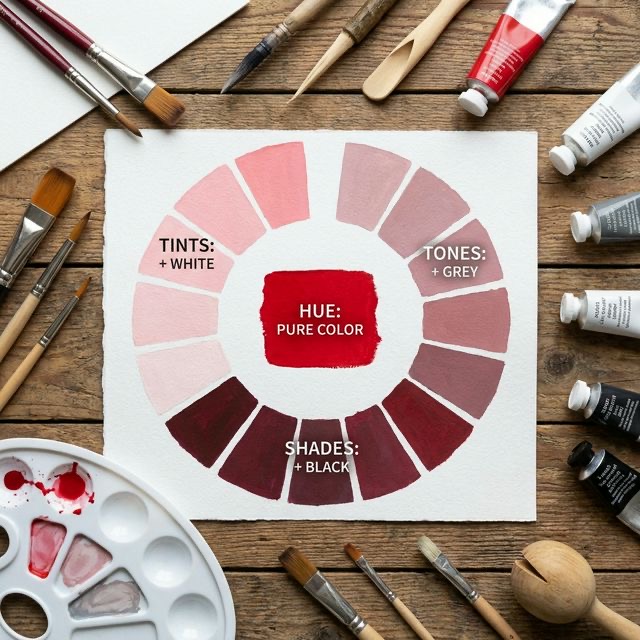
1. What is a Hue? (The Pure Color)
To understand tints, tones, and shades, we must start at the very beginning with the concept of a hue.
Hue is simply the formal, technical term for the name of a color. It is the purest, most basic form of a color that you can possibly have. If you look at a traditional 12-part color wheel, every single color you see on that wheel (Red, Red-Orange, Orange, Yellow-Orange, etc.) is a pure hue.
Why is it called "Pure"?
A pure hue contains absolutely no white, no black, and no grey. It has not been altered, lightened, darkened, or muted in any way. * Imagine a tube of brilliant, fire-engine red acrylic paint straight from the manufacturer. That is a pure red hue. * Think of the bluest, brightest sky you have ever seen on a perfect summer day. That is a pure blue hue.
When you start mixing neutral colors (white, black, or grey) into a pure hue, you change its properties. It is no longer a pure hue; it becomes a tint, tone, or shade.
2. What is a Tint? (Adding White)
A tint is created whenever you take a pure hue and add pure white to it.
The purpose of a tint is to lighten the color. Adding white increases the "value" (how light a color is) while reducing the intensity of the hue. Tints are often referred to as pastel colors. They are soft, delicate, and airy.
Crafting with Tints
Imagine taking that tube of pure fire-engine red paint. If you squeeze out a small amount of red and mix it into a large puddle of pure white paint, what happens? You get pink! Pink is not a hue; it is a tint of red.
The same goes for other colors: * Lightening pure blue with white gives you baby blue or pastel blue. * Lightening pure purple with white gives you lavender or lilac. * Lightening pure orange with white gives you peach or apricot.
Psychological Effects of Tints
Because tints are softer and lighter than pure hues, they carry a very different psychological weight. Tints are fundamentally calming, youthful, delicate, and sweet. This is exactly why tints (pastels) are the go-to color palettes for nurseries, baby showers, spring weddings, and Easter decorations. They feel peaceful and gentle on the eyes.
3. What is a Shade? (Adding Black)
If adding white creates a tint, what happens when you go in the opposite direction? A shade is created whenever you take a pure hue and add pure black to it.
The purpose of a shade is to darken the color. Adding black decreases the value (making it darker) and makes the color feel richer and heavier.
Crafting with Shades
Mixing shades can be incredibly tricky for crafters and painters. Black is a highly dominating pigment. It takes very little black paint to completely swallow up a lighter hue. If you want to make a shade of yellow, you cannot add black to yellow; you must add a microscopic drop of yellow to black, or you will ruin the mix.
- Darkening pure red by adding black gives you maroon or burgundy.
- Darkening pure blue by adding black gives you navy or midnight blue.
- Darkening pure green by adding black gives you forest green or hunter green.
Psychological Effects of Shades
Shades are the heavy hitters of the color world. Because they are dark and rich, they evoke feelings of maturity, mystery, drama, elegance, and power. Think about a formal living room painted in a deep shade of navy blue or emerald green. It instantly feels luxurious, cozy, and sophisticated. When you want your craft projects to look expensive, grounded, or moody (like a gothic junk journal or a masculine quilt), you should rely heavily on shades.
4. What is a Tone? (Adding Grey)
Now we arrive at the most complex, and arguably the most important, of the three mixing properties: the tone. A tone is created whenever you take a pure hue and add pure grey (a mixture of black and white) to it.
Adding grey to a color mutes it. It pulls the intensity and vibrancy completely out of the pure hue, making it look duller, softer, and more natural.
Crafting with Tones
In the real world, surprisingly few things are pure hues, pure tints, or pure shades. Almost everything you see in nature is a tone. The green of a leaf outside your window is rarely a pure, shocking green; it is a muted, earthy olive or sage green. Tones are everywhere because they are subtle and easy on the eyes.
- Muting a pure orange with grey gives you rust, terracotta, or burnt sienna.
- Muting a pure yellow-green with grey gives you olive green.
- Muting a pure purple with grey gives you dusty plum or mauve.
Psychological Effects of Tones
Because tones are muted and desaturated, they are incredibly sophisticated and easy to work with. Tones are elegant, vintage, earthy, and highly versatile.
When you use pure, high-intensity hues (like neon pink and bright turquoise) in a craft project, it is very easy for them to clash and hurt the viewer's eyes. But if you use tones of pink (like dusty rose) and tones of turquoise (like slate blue), they blend together beautifully in perfect harmony.
If you are a beginner looking to create a fail-proof color palette for home decor, knitting, or scrapbooking, start building your palettes with tones. They are the forgiving, unsung heroes of color theory!
5. Value vs. Saturation: Putting It All Together
Understanding hue, tint, tone, and shade is essentially a masterclass in two major art concepts: Value and Saturation.
- Value refers exclusively to lightness and darkness. Tints have a high value (very light). Shades have a low value (very dark). Pure hues exist right in the middle.
- Saturation (sometimes called Intensity or Chroma) refers to how bright or dull a color is. Pure hues are highly saturated (super bright). Tones are desaturated (dull and muted).
When you hear a designer talk about choosing a "low value, desaturated red," they are no longer speaking gibberish to you. You know exactly what they mean: they are choosing a dark, muted shade of red—like a dusty, dark burgundy!
A Quick Cheat Sheet for Crafters
Keep this simple cheat sheet near your crafting desk whenever you are mixing paints, buying yarn, or planning a project:
- Hue = The Pure, Bright Color (Vibrant, Loud, Energetic)
- Tint = Hue + White (Light, Pastel, Soft, Calming)
- Shade = Hue + Black (Dark, Rich, Moody, Elegant)
- Tone = Hue + Grey (Muted, Earthy, Vintage, Sophisticated)
By mastering these four terms, you have unlocked the entire spectrum of human color. You are no longer limited to the 12 colors on the wheel. You can now confidently navigate thousands of subtle, beautiful colors, using them perfectly to bring your creative vision to life!