- Posted on
- • Color Psychology
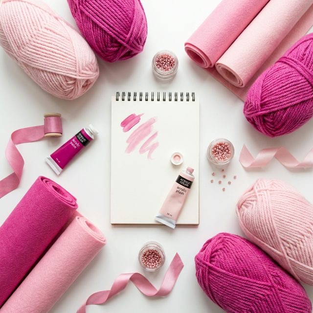
Pretty in Pink: Soft and Bold Approaches to Crafting
- Author
-
-

- User
- C&C Admin
- Posts by this author
- Posts by this author
-
For many years, the color pink has been unfairly typecast. In modern Western culture, it has been heavily restricted to a single demographic: young girls. Consequently, many adult crafters, artists, and interior decorators intentionally avoid the color, fearing it will make their work look childish, overly sweet, or unserious.
However, writing off the entire color pink is a massive mistake. Pink is one of the most versatile, complex, and emotionally powerful colors you can use. Depending entirely on the specific shade and how you pair it, pink can be either the softest, most innocent color in your toolbox, or the most rebellious, high-energy punch you can throw.
Let’s unpack the fascinating psychology behind this misunderstood color, and learn how to master both the soft and bold approaches to crafting with pink.
1. The Real History of Pink
Before we look at how to use pink today, we have to look backwards. The idea that "pink is for girls" is actually a very recent invention, dating back only to the mid-20th century.
If you look at European history, pink was simply a lighter shade of red. Because red was a color of military power, passion, and royalty, pink was considered a strong, masculine color. It was frequently used for young boys' clothing, while delicate, calming blue was considered the appropriate color for young girls.
It was not until the post-World War II era, heavily driven by mass marketing and department store advertising, that the gender associations flipped. Today, artists and designers are actively reclaiming pink, liberating it from its purely childhood associations and using it as a serious, sophisticated design element.
2. The Soft Approach: Tints and Tones
When most people think of pink, they are thinking of a "tint"—pure red mixed with a large amount of pure white. This creates the classic baby pink, blush, or rose petal pink.
The Psychology of Soft Pink
Soft pinks trigger a very specific, deeply calming psychological response. In fact, a specific shade called "Baker-Miller Pink" has been proven to physically lower human heart rates and reduce aggressive behavior. Emotionally, soft pink represents: * Unconditional love and nurturing * Innocence and youth * Nostalgia and romance * Physical tranquility
Crafting with Soft Pink
Soft pink is incredibly delicate, which means it can easily look washed out if you surround it with harsh, aggressive colors like pure black or neon yellow.
To keep soft pink looking sophisticated: * Pair it with earthy greens: Think of a blooming rose bush. Pairing blush pink with muted sage or olive green grounds the pink in nature, keeping it from looking like bubblegum. * Pair it with warm metallics: Blush pink paired with warm brass, copper, or rose gold looks incredibly expensive and chic. This is a very popular palette for modern interior design and handmade jewelry. * Use it as a neutral background: A very pale pink cardstock is an incredible substitute for stark white paper. It provides warmth and a subtle vintage feel without fighting for attention.
3. The Bold Approach: Saturated Shades
If soft pink is a gentle whisper, bold pink is a loud, joyful shout. When you move away from the white-heavy tints and look at highly saturated pinks (like magenta, hot pink, and fuchsia), the psychology changes entirely.
The Psychology of Bold Pink
Because these colors retain so much of the fiery energy of their parent color (red), they are highly stimulating. However, they lack the "danger" or "aggression" associated with pure red. Emotionally, bold pink represents: * Rebellious joy and playfulness * High energy and excitement * Confidence and modern feminism * Creative fearlessness
Crafting with Bold Pink
Bold pinks demand attention. They vibrate with energy and immediately draw the eye.
To use bold pink effectively: * The "Pop" of Color: Hot pink is the ultimate accent color. If you are knitting a stark, modern, black-and-white geometric blanket, adding a single, thin stripe of neon magenta will completely electrify the entire design. * Pair it with Orange or Yellow: If you want a project to scream "Summer!" pair hot pink with bright tangerine or sunny yellow. This palette is incredibly tropical, loud, and inherently happy (perfect for summer party decorations or bright acrylic pouring). * Tame it with Navy Blue: If you want the energy of hot pink but need it to look slightly more formal, pair it with a very dark, conservative navy blue. The dark blue anchors the wild energy of the pink, creating a beautifully balanced, modern look.
4. Nuance: The Sophistication of "Dusty" Pink
There is a middle ground between the innocent baby pinks and the loud neon magentas, and it is quietly taking over the design world: Dusty Pink (also known as Millennial Pink or Mauve).
A dusty pink is a "tone"—it is created by mixing red not just with white, but also with a small amount of grey or brown. This instantly desaturates the color, removing the sweetness of baby pink and the aggression of hot pink. * The feeling: Dusty pink is incredibly earthy, vintage, and grounded. It feels mature, calm, and highly refined. * Crafting tip: If you are afraid of using pink in your home decor crafts, start here. A chunky knit blanket or a textured macrame wall hanging in a dusty, muted pink functions almost exactly like a neutral tan or beige, but it provides significantly more warmth and visual interest.
Conclusion
Pink does not have to be sweet, and it certainly does not have to be childish. By understanding the vast difference between a soft, nurturing blush, a rebellious, energetic magenta, and a grounded, sophisticated dusty rose, you unlock an entirely new level of creative freedom.
The next time you are planning a project, do not skip over the pink aisle. Whether you are aiming for a quiet, romantic masterpiece or a loud, modern statement piece, there is a perfect shade of pink waiting to bring your vision to life.