- Posted on
- • Color Psychology
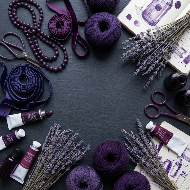
The Mystery of Purple: Creating Elegant DIY Decor
- Author
-
-

- User
- C&C Admin
- Posts by this author
- Posts by this author
-
Of all the colors on the traditional color wheel, none is quite as mysterious, misunderstood, or majestic as the color purple. It does not exist as frequently in nature as the sprawling greens and blues. It doesn't scream with the biological urgency of red or the pure joy of yellow. Instead, purple exists quietly in the shadows—in twilight skies, in the petals of rare orchids, and in the depths of amethyst crystals.
Because it is relatively rare in the natural world, human history and modern psychology have assigned purple a very specific, elevated status. It is the color of luxury, spirituality, and boundless imagination.
Whether you love it or hate it, there is no denying the power of purple. If you want to elevate your crafting projects from "homemade" to "high-end," understanding the psychology of purple is essential. Let’s dive into the regal history of this fascinating color and learn how to use it to create elegant DIY decor.
1. The Historical Weight of Purple
To understand how our modern brains react to the color purple, we have to travel back in time to the ancient Mediterranean world.
For thousands of years, the color purple was quite literally worth more than its weight in gold. Before the invention of modern synthetic dyes in the 1850s, creating purple dye was an incredibly difficult, foul-smelling, and expensive process. The most famous dye, Tyrian Purple, was created by harvesting thousands of tiny, rotting sea snails from the coast of modern-day Lebanon. It took over 10,000 snails to produce enough dye to color a single cloak!
Because it was so astronomically expensive to produce, only emperors, kings, queens, and high-ranking clergy could afford to wear it. In some ancient empires, if a commoner was caught wearing the color purple, they could be put to death.
The Lingering Psychology
Even though you can now buy a tube of purple acrylic paint for a few dollars at any craft store, the thousands of years of human history associating purple with extreme wealth have not been erased from our subconscious.
When humans see the color purple, we instantly associate it with: * Royalty and Nobility * Luxury and Wealth * Extravagance * Grandeur and Sophistication
If you want your craft projects to look expensive and luxurious, purple is the ultimate visual shortcut.
2. The Balance of Opposites
Biologically and psychologically, purple is an incredibly unique color because of how it is created. Purple is a secondary color, born from the exact 50/50 mixture of two polar opposites: * Blue: The coolest, calmest, and most stable color on the wheel. * Red: The warmest, most energetic, and most aggressive color on the wheel.
Because it contains both the fiery energy of red and the icy calm of blue, purple creates a psychological equilibrium. It is highly stimulating to the imagination (thanks to the red), but it is also deeply soothing to the nervous system (thanks to the blue).
Because of this unique balance, purple has long been associated with the spiritual realm, the subconscious mind, and deep meditation. It encourages introspection and creative thinking.
3. Navigating the Shades of Purple
Just like any other hue, purple dramatically changes its psychological impact depending on whether it is a tint (mixed with white), a tone (mixed with grey), or a shade (mixed with black).
Light Purples (Lavender, Lilac)
Light purples are tints created by adding pure white to a purple base. * The feeling: Light purples lose all of the heavy majesty of their darker counterparts. They become incredibly delicate, sweet, nostalgic, and romantic. They often evoke a sense of spring and gentle femininity. * Crafting tip: Use lavender for romantic, vintage-inspired projects. A soft lilac watercolor wash is the perfect background for a delicate calligraphy wedding invitation or a sweet, floral embroidery hoop.
Muted Purples (Mauve, Dusty Plum)
Muted purples are tones created by adding grey to a purple base. * The feeling: Tones of purple are incredibly sophisticated, earthy, and vintage. Because they are desaturated, they do not overwhelm the eye. * Crafting tip: Mauve is the ultimate "grown-up" purple. Use it for interior decor projects like throwing pillows or painted furniture. It provides a massive amount of elegant color without feeling like a child's playroom.
Dark Purples (Eggplant, Royal Violet)
Dark purples are shades created by adding black to a purple base. * The feeling: This is where the true luxury lives. Deep, dark purples feel incredibly wealthy, mysterious, and profound. They demand respect and attention. * Crafting tip: Dark purple is visually heavy. Use it in rich textures like velvet, dark stained wood, or thick, glossy resin. A deep plum accent wall or a dark violet macrame wall hanging instantly grounds a room and makes it feel incredibly expensive.
4. Perfect Purple Pairings
Because purple is such a complex mixture of hot and cold, pairing it with other colors can be intimidating. Here are three foolproof color palettes to ensure your purple projects look professionally designed.
1. The "Royal Jewel" Palette (Purple + Gold)
If your goal is absolute, undeniable luxury, pair a deep, dark shade of purple (like eggplant) with a metallic, warm gold. * Why it works: Purple and yellow are complementary colors (exact opposites), meaning they provide maximum visual contrast. The rich depth of the dark purple makes the metallic gold look incredibly bright and expensive. * Try it: If you are painting a piece of thrifted wooden furniture, paint the main body a dark, matte plum color, and replace the old hardware with bright, shiny brass drawer pulls.
2. The "Twilight Garden" Palette (Purple + Green)
For a look that is both deeply sophisticated and rooted in nature, pair purple with an earthy green (like olive or sage). * Why it works: Purple and green are almost natural opposites, but they frequently appear together in the natural world (think of a lavender field or an eggplant growing on a vine). The earthy green grounds the "magical" feeling of the purple, keeping the project from feeling too fantastical. * Try it: When knitting a heavy winter sweater or designing a quilt, pair a dusty mauve with a deep, muted olive green. It is a highly unexpected combination that looks incredibly chic and modern.
3. The "Soft Monochromatic" Palette (Varying Tints)
If you want to create a room or a project that feels deeply spiritual, calming, and focused on self-care, use a monochromatic purple palette. * Why it works: Using only tints and shades of a single color removes visual clutter. Surrounding yourself with soft lavenders, lilacs, and mauves calms the heart rate while stimulating the imagination. * Try it: For a relaxing bathroom or home office, craft your own handmade soap, candles, and bath salts using varying shades of purple dye and dried lavender flowers.
Conclusion
Purple is not a color for the faint of heart. It is a color that carries the weight of empires, the mystery of the cosmos, and the delicate beauty of a spring garden all at the same time.
Do not let its complexity intimidate you. By understanding how to balance its fiery red roots and its icy blue branches, and by choosing the perfect sophisticated pairings like gold or olive green, you can unlock the elegant power of purple. The next time you want to make a craft project that truly feels luxurious and magical, skip the basic colors and embrace the mystery.