- Posted on
- • Color Psychology
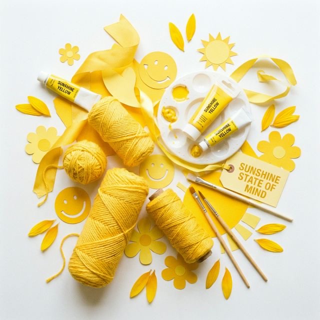
Sunny Yellows: Invoking Joy in Your DIY Projects
- Author
-
-

- User
- C&C Admin
- Posts by this author
- Posts by this author
-
Think back to the very first time you were handed a box of crayons as a child and asked to draw a picture. Chances are, one of the very first things you did was reach for the bright yellow crayon to draw a smiling sun in the top corner of the page.
From our earliest memories, human beings associate the color yellow with happiness, warmth, and light. It is the most luminous color on the visible spectrum, meaning it is the color that captures the human eye faster than any other. Because it is so bright and powerful, it is also one of the easiest colors to get wrong in art and design.
If you want your crafts to radiate positivity, you need to understand the psychology behind this vibrant hue. Let’s explore the uplifting power of yellow, learn why it affects our brains the way it does, and discover how to use it perfectly to inject sunshine into your creative projects.
1. The Psychology of Sunshine
Color psychology is not just about personal preference; it is deeply rooted in human history and biology. Like the other primary colors, yellow triggers a specific, involuntary reaction in the human brain.
The Biological Uplift
Because yellow is the lightest and brightest hue on the color wheel, looking at it mimics the experience of stepping out into bright daylight. Exposure to yellow light has been scientifically proven to stimulate the left side of the human brain—the side associated with logic, analytical thinking, and mental agility.
Beyond making us think faster, yellow stimulates the nervous system in a way that promotes joy. It is intrinsically linked to the release of serotonin, the chemical in the brain responsible for feelings of well-being and happiness.
The Cultural Connection
Culturally, yellow is universally recognized as the color of optimism. * It is the color of blooming sunflowers, ripe lemons, and spring daffodils. * It represents the energy of a new day and the warmth of the summer sun. * In many Eastern cultures, yellow is considered an imperial color, symbolizing glory, wisdom, and harmony.
When you use yellow in a craft project, you are sending a subconscious message to the viewer: "Smile. Be happy. Everything is going to be okay."
2. Navigating the Shades of Yellow
Just because yellow is the color of happiness does not mean you should paint your entire house neon yellow. Yellow is incredibly reflecting; it bounces a massive amount of light into the eye. If used in large, highly saturated quantities, it can actually cause visual fatigue and feelings of anxiety.
To use yellow effectively, you must understand its different variations.
Bright, Pure Yellow (Lemon, Canary, Neon)
Pure, highly saturated yellow is the loudest color on the wheel. * The Psychology: It is energetic, youthful, and impossible to ignore (which is why school buses and taxi cabs are painted yellow). * Crafting Tip: Use pure yellow strictly in small doses as an accent color. A single bright yellow flower on a dark blue scrapbook page will look stunning and joyful. A scrapbook page completely covered in neon yellow paper will hurt the viewer's eyes.
Warm, Golden Yellow (Mustard, Ochre, Amber)
Golden yellows are created by shifting the hue slightly toward orange, or by muting it slightly with grey (creating a tone). * The Psychology: These yellows lose the "loud" energy of pure yellow and replace it with a feeling of deep, cozy warmth. They feel historic, earthy, and sophisticated. * Crafting Tip: If you want to use a large amount of yellow (like knitting a chunky sweater or painting a piece of furniture), rely on mustard or ochre. They provide all the optimism of yellow without the visual strain.
Pale Yellow (Pastel, Buttercream, Cream)
Pale yellows are tints, created by mixing pure yellow with white. * The Psychology: Tints of yellow are soft, delicate, and deeply comforting. They evoke feelings of innocence, freshness, and quiet mornings. * Crafting Tip: Pale yellow acts beautifully as a neutral background color. If stark white paper feels too cold or clinical for a greeting card, swap it out for a soft buttercream yellow. It will instantly make the card feel warmer and more inviting.
3. Creating Joyful Color Palettes
Yellow plays incredibly well with others, provided you understand the science of the color wheel. Here are three foolproof color palettes that use yellow to invoke joy in your DIY projects.
1. The "Citrus Burst" Palette (Analogous)
For a project that feels incredibly fresh, summery, and energetic, pair yellow with its immediate neighbors on the color wheel: Yellow-Green (Lime) and Yellow-Orange (Tangerine). Because these colors are analogous, they blend seamlessly. This palette is perfect for summer party decorations, outdoor porch pillows, or bright floral watercolor paintings. It is the visual equivalent of a cold glass of lemonade on a hot day.
2. The "Twilight Contrast" Palette (Complementary)
If you want your yellow crafts to truly pop, you must pair them with their exact opposite: Purple. Because yellow is the lightest color on the wheel and purple is the darkest, the contrast between them is explosive. To keep this palette sophisticated rather than overwhelming, use a dark, muted purple (like eggplant or plum) as your dominant background, and use a bright, pure yellow (like canary) for your accents. The yellow will look like glowing stars set against a dark night sky.
3. The "Crisp and Clean" Palette (Yellow + White/Grey)
If you are designing a modern, minimalist space, pair a warm yellow (like mustard) with stark whites and cool greys. Grey is a deeply calming, neutral tone, but on its own, it can sometimes feel depressing or sterile. By adding a pop of yellow, you instantly warm the grey up, creating a space that feels both highly sophisticated and deeply joyful. This is a very popular palette for modern nurseries, sleek living rooms, and modern quilting patterns.
4. Practical Yellow Projects for the Home
Ready to start crafting with sunshine? Here are a few ways to inject yellow into your creative life:
- Entryway Decor: The entryway is the first thing people see when they walk into your home. Paint a wooden welcome sign or a small accent table in a bright, cheerful yellow. It guarantees that every guest is greeted with a feeling of warmth and optimism.
- Kitchen Textiles: The kitchen is the heart of the home, associated with warmth and nourishment. Sew a set of bright yellow dish towels or crochet a set of sunny cotton potholders. They will make brewing your morning coffee feel infinitely more cheerful.
- "Cheer Up" Cards: When crafting a "Get Well Soon" or "Thinking of You" card, yellow is mandatory. A handmade card featuring a bright yellow watercolor sunflower or a stamped yellow bumblebee will instantly uplift the recipient's spirits far more than a somber blue or grey card.
Conclusion
Yellow is a force of nature. It is the color of the sun, the color of blooming spring, and the color of unbridled optimism. While it can be visually tricky to balance, pushing past the fear of this bright hue is incredibly rewarding.
By understanding how yellow stimulates the brain, knowing when to soften it into a deep mustard or a pale buttercream, and pairing it perfectly with cool purples or crisp greys, you can master the happiest color on the wheel. The next time you sit down at your crafting desk, do what you did when you were a child. Reach for the yellow, and bring a little bit of sunshine into the world.