- Posted on
- • Color Psychology
Earthy Greens: Bringing Nature Indoors Through Art
- Author
-
-

- User
- C&C Admin
- Posts by this author
- Posts by this author
-
Have you ever noticed how a simple walk through a forest or a park can instantly clear your mind and lower your stress levels? There is a Japanese practice called Shinrin-yoku, or "forest bathing," which involves simply spending time surrounded by trees to improve physical and mental health. But what if you could not make it to the forest? What if you could bring the healing power of the forest directly to your crafting table?
The secret to forest bathing is not just the fresh air; it is the overwhelming presence of the color green. Green is the most abundant color in the natural world. It is the color of life, renewal, and steady growth. By intentionally incorporating earthy greens into your DIY projects, you can trick your brain into feeling the same peace and vitality that you experience outdoors.
Let’s dig into the earthy psychology of green and explore how you can use nature-inspired palettes to breathe fresh life into your art.
1. The Psychology of Green
If you look at the color wheel, green sits perfectly between the warm, energetic yellow and the cool, deeply calm blue. Because it is a secondary color born from these two polar opposites, green is the ultimate color of balance.
The Easiest Color to See
Biologically speaking, green is the single easiest color for the human eye to process. Because it sits directly in the center of the visible light spectrum, the lens of your eye does not have to constantly adjust to focus on it. Looking at green actually requires zero muscular effort from your eyes.
This is why green is so profoundly relaxing to look at. When you stare at a massive, green landscape painting or a quilt made of varying green fabrics, your eyes and your brain are literally resting.
The Symbol of Life
Psychologically, green is universally recognized as the color of life. In human history, finding green meant finding water, food, and safety. Because of this ancestral connection, green makes us feel secure. It represents growth, health, fertility, and renewal.
When you use green in your crafts, you are subconsciously communicating a message of safety, health, and a return to basics.
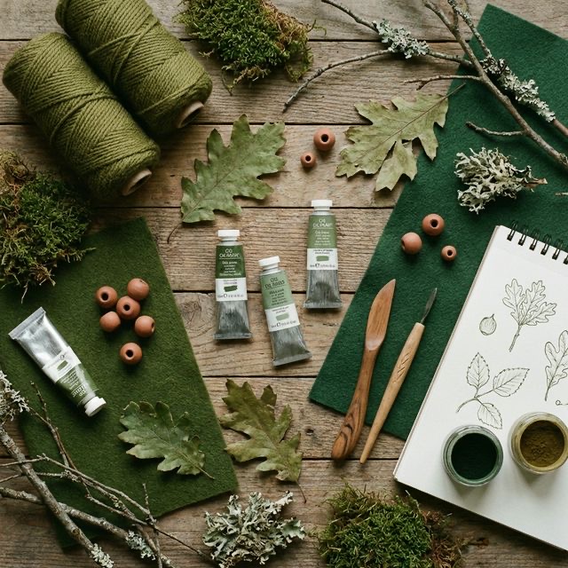
2. Navigating the Earthy Greens
"Green" is a massive category. A neon, highly saturated, lime-green plastic toy feels very different from a quiet, mossy forest floor. If your goal is to bring nature indoors, you must move away from the bright, highly saturated greens and focus on the earthy greens.
Earthy greens are "tones"—they are green hues that have been muted and desaturated by mixing them with grey or brown. This muting effect makes them look infinitely more natural and sophisticated.
Olive Green
Olive green is created by adding a significant amount of yellow and brown (or grey) to a base green. * The Psychology: Olive is deeply grounded, historic, and incredibly sophisticated. It feels warm, safe, and ancient. * Crafting Tip: Olive acts beautifully as a dark neutral. Use olive green yarn for heavy winter sweaters or blankets. It provides a massive amount of warmth without shouting for attention.
Sage Green
Sage green is a pale tint and tone combination. It is a green mixed with white and a lot of grey, giving it a slightly silvery appearance. * The Psychology: Sage is the color of quiet mornings and dried herbs. It is incredibly delicate, calming, and refined. * Crafting Tip: Sage green is the modern crafter's best friend. If you want to paint a piece of wooden furniture or design a wedding invitation, sage green provides a subtle, natural elegance that stark white cannot match.
Forest Green
Forest green is a dark shade, created by adding black to a pure green base. * The Psychology: Forest green is mysterious, deep, and enveloping. It represents the quiet, shaded depths of an old-growth forest. It feels incredibly wealthy and protective. * Crafting Tip: Use forest green when you want a project to feel expensive and luxurious. A deep forest green velvet pillow or a dark green stained-glass panel instantly grounds a room and provides a sense of quiet luxury.
3. Creating Nature-Inspired Palettes
Earth tones rarely exist alone in nature. To truly capture the feeling of the outdoors in your crafting, you must pair your earthy greens with the colors they naturally live alongside. Here are three incredibly effective, nature-inspired palettes.
1. The "Forest Floor" Palette (Green + Brown)
To ground your crafts completely in nature, pair shades of green (like olive or forest) with rich, earthy browns, tans, and creams. * Why it works: Think of a tree: green leaves and a brown trunk. This is the most natural, reliable color combination on the planet. * Try it: If you are weaving a wall hanging, use thick, textured cream and brown wool for the base, and weave in thick stripes of olive green roving. The result will look organic, deeply textured, and incredibly cozy.
2. The "Desert Oasis" Palette (Green + Terracotta)
If you want to add a punch of warmth and energy to your earthy greens, look to the desert. Pair a soft, silvery sage green with a warm, dusty terracotta (a muted red-orange). * Why it works: Green and red are opposites on the color wheel. However, by muting the green into a dusty sage and the red into a dusty terracotta, you create perfect, gentle complementary contrast. It is warm, inviting, and wildly popular in modern "boho" interior design. * Try it: Paint simple terracotta clay pots with beautiful, delicate sage-green geometric patterns. The contrast of the orange clay and the cool green paint is stunning.
3. The "Coastal Driftwood" Palette (Green + Blue + Grey)
To capture the calming, misty feeling of the coast, pair soft, muted greens (like seafoam) with pale blues and warm, sandy greys. * Why it works: This is an analogous palette (colors sitting next to each other on the wheel), anchored entirely by soft, neutral greys. It mimics the colors of sea glass, driftwood, and ocean water. * Try it: If you are watercolor painting, do a soft, fluid wash using pale blues, greens, and greys. The boundaries will blur together, creating an incredibly peaceful, hazy background for hand lettering or ink drawing.
4. Bringing the Outside In
The easiest way to make your crafts feel connected to nature is to actually use nature in them. If you are working with an earthy green palette, leaning heavily into natural textures will elevate the psychology of the color.
- Use Natural Fibers: A bright, toxic-green acrylic yarn feels completely different than a natural, undyed wool yarn that you have hand-dyed with green botanicals. The rough, organic texture of the natural wool reinforces the "earthy" message.
- Include Real Botanicals: If you are pouring resin coasters or making handmade soap, mixing drops of olive green dye with actual, dried eucalyptus leaves or pressed ferns creates a stunning, literal connection to the forest.
Conclusion
We spend the vast majority of our lives indoors, staring at glowing screens and surrounded by harsh, artificial lighting. By intentionally choosing to craft with earthy, muted greens, we are throwing a lifeline back to the natural world.
The color green is restorative. It gives our eyes a break, lowers our stress, and subconsciously reminds us of the quiet, steady growth of the forest. The next time you find yourself feeling disconnected or burnt out, pick up some sage paint, some olive yarn, or some forest green fabric. Let nature do the healing, right at your crafting desk.