- Posted on
- • Color Psychology
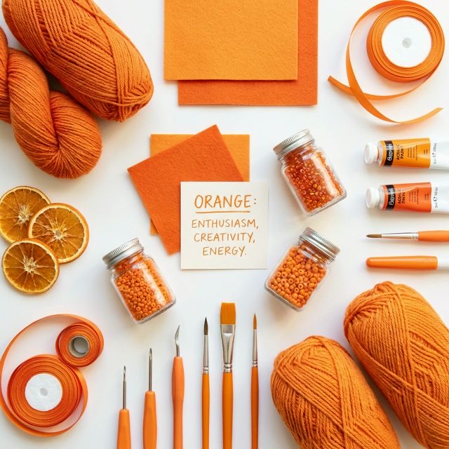
Using Orange to Spark Creativity and Enthusiasm
- Author
-
-

- User
- C&C Admin
- Posts by this author
- Posts by this author
-
Have you ever walked down the craft aisle, felt extremely uninspired, and then suddenly had an idea pop into your head when you spotted a bright, neon skein of yarn? It might sound like a coincidence, but if that yarn was orange, it was pure science at work.
Of all the colors on the wheel, orange has the most unique relationship with the human imagination. While blue calms us down and red speeds up our heart rate, orange holds the very specific power to stimulate our creativity.
Whether you are painting a canvas, decorating an office space, or simply trying to break out of a creative block, the color orange is an incredible tool. Let’s dive into why our brains love this citrusy hue, and learn how to use it to spark massive enthusiasm in your next DIY project.
1. The Energy of the Sun and the Fire
Orange does not exist on its own; it is the child of the two most intense, passionate colors on the spectrum. To understand the psychology of orange, you must look at its parents: * Red: The color of fire, blood, and physical stamina. It is highly emotional and incredibly urgent. * Yellow: The color of the sun, joy, and mental clarity. It is optimistic and highly analytical.
When you mix these two forces together, you create a perfect middle ground. Orange takes the intense physical energy of red and combines it with the logical, joyful optimism of yellow. The result is a color that feels incredibly warm, inviting, and—most importantly—social.
Why Does It Make Us Creative?
Because it balances the physical with the mental, orange stimulates the area of the brain associated with playfulness and enthusiasm. It lowers our inhibitions just enough to make us feel brave. Think about being a child on a playground—you were not worried about making mistakes; you were just exploring and having fun. That is exactly the emotional state you need to be in to create truly original art. The color orange acts as a visual permission slip to experiment, get messy, and step outside the box.
2. A Brief History of Orange
For a very long time, the color orange did not even have a name! In ancient European languages, it was simply referred to as "yellow-red." It wasn't until the late 15th century, when Portuguese merchants brought the first sweet citrus fruits from Asia to Europe, that the color finally received the name we use today: the "orange."
Ancient Pigments
Long before the fruit arrived, artists were creating orange pigments using highly toxic natural minerals. * Realgar: An arsenic sulfide mineral that ancient Egyptians used to paint tomb walls. It created a stunning yellow-orange, but it was incredibly poisonous to handle. * Minium: Also known as "red lead," this vibrant orange-red pigment was heavily used in medieval illuminated manuscripts. The artists who worked closely with it often suffered from severe lead poisoning.
Today, thanks to the magic of modern chemistry, we no longer have to risk our lives to paint a beautiful autumn sunset! A simple, non-toxic tube of cadmium orange hue provides all the brilliance with none of the danger.
3. Navigating the Shades of Orange
Like all colors, the exact shade of orange you use will completely change the emotional temperature of your craft project.
Bright Orange (Tangerine, Neon, Carrot)
These pure, highly saturated hues are the loudest variations of the color. * The feeling: They are incredibly playful, youthful, active, and a little bit loud. In large doses, they can actually be overwhelming. * Crafting tip: Use bright tangerine for small, high-energy accents. If you are crocheting a soft, grey blanket, add a single, thin stripe of bright orange at the very edges. The pop of color will look modern, playful, and incredibly chic.
Muted Orange (Terracotta, Rust, Burnt Orange)
These tones are created by adding grey or brown to the base color, making them look highly natural and earthy. * The feeling: Rust and terracotta are the colors of autumn. They feel deeply grounded, mature, historic, and incredibly cozy. They invite people to sit down, relax, and stay a while. * Crafting tip: If you want to use orange in large quantities (like painting an entire accent wall in a living room or throwing a large handmade quilt on a bed), always use muted oranges. They provide massive warmth without hurting the eyes.
Light Orange (Peach, Apricot)
These delicate tints are created by mixing pure orange with white. * The feeling: Peach is the color of a quiet sunrise. It is extremely gentle, sweet, innocent, and inherently friendly. * Crafting tip: Peach is a phenomenal substitute for standard pink. If you are decorating a nursery or making a romantic, floral greeting card, swap traditional baby pink for a soft apricot. It provides the same sweetness, but it feels much warmer and more inviting.
4. Perfect Pairings to Spark Joy
Because orange is such a loud, confident color, it can be intimidating to pair it with other hues. Here are three foolproof color palettes that perfectly utilize the energy of orange.
1. The "Mid-Century Modern" Palette (Orange + Teal)
This is arguably the most famous orange pairing in modern design history. * Why it works: Orange and blue sit directly across from each other on the color wheel, making them exact complements. Teal is a deep, muted blue-green, while burnt orange is a warm, muted yellow-red. The contrast is gorgeous but perfectly balanced because both colors are slightly muted. * Try it: If you are restyling an old mid-century wooden chair, leave the warm, orange-toned wood exposed, but re-cover the seat cushion in a beautiful, rich teal velvet.
2. The "Sunset Glow" Palette (Orange + Pink + Gold)
If you want to create a project that feels incredibly romantic, warm, and feminine, stick entirely to the warm side of the color wheel. * Why it works: These are analogous colors (colors that live next to each other on the wheel). Because there are no cool colors acting as a contrast, the entire palette visually blends together into a seamless wash of heat and light. * Try it: When pouring resin jewelry or creating a layered alcohol ink painting, let bright pinks, soft peaches, and metallic golds bleed together. The result will look exactly like a tropical sunset.
3. The "Earthy Grounding" Palette (Orange + Olive Green)
If you want your orange to feel natural and historic, pair it with the colors of the forest. * Why it works: This mimics the visual of autumn leaves hanging on a tree. The deep, dark, earthy presence of the olive green anchors the bright, floating energy of the orange leaf. * Try it: When embroidering a dense botanical hoop, use dark olive greens for all of the leaves and stems, and use a bright rust-orange string for the flower petals. The flowers will jump beautifully off the fabric.
Conclusion
Orange is not a color for the faint of heart, but it is an absolute necessity for anyone looking to break out of a creative rut. It is the color of enthusiasm, the color of fearless childhood play, and the color of boundless, warm energy.
The next time you find yourself staring at a blank canvas or a massive stash of yarn with absolutely no ideas, do not reach for the safe, sensible neutrals. Reach for the loudest, brightest orange you can find. Let the color do the heavy lifting, and watch as your creativity sparks back to life.