Color & Crafts

Image

Posts with type Image by Color & Crafts
  • Posted on
    Calming Blues: Crafting for Stress Relief and Serenity

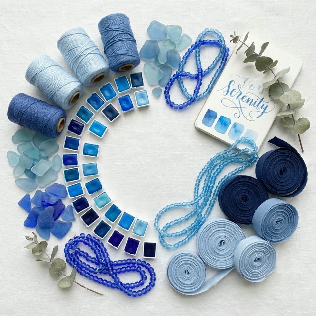
    Have you ever found yourself instinctively drawn to the beach when you are stressed? Do you ever find yourself staring up at a clear sky when you need a mental break? If so, you are experiencing the powerful, deeply ingrained psychological effects of the color blue.

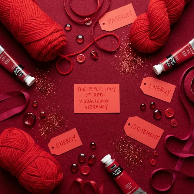
    Blue is the world's most popular color, and for a very good reason. While colors like red and yellow stimulate the nervous system and raise our heart rates, blue does the exact opposite. It is nature's ultimate tranquilizer.

    In the fast-paced, high-stress modern world, crafting is often used as a form of meditation and self-care. But if you combine the physical act of crafting with the psychological power of the color blue, you can create a truly restorative, healing experience. Let’s dive into the science behind the serenity of blue, and explore how to use this incredible color to craft your way to a clearer, calmer mind.

  • Posted on
    The Psychology of Red: Adding Energy to Your Crafts

    Think about the last time you saw a bright red sports car zoom past you. Or imagine the feeling of walking a red carpet, holding a bouquet of red roses, or seeing a red clearance tag at your favorite craft store.

    More than any other color on the spectrum, red demands an immediate physical and emotional reaction. It is loud, it is unavoidable, and it is incredibly powerful. Because of this, red is one of the most exciting (yet dangerous) colors to use in your crafting projects. If you use it perfectly, your project will pulse with life and energy. If you use it recklessly, it can become aggressive and visually exhausting.

    Let’s unpack the fascinating psychology behind the color red, and learn how to harness its fiery energy to make your DIY crafts truly unforgettable.

  • Posted on
    Complementary Colors: Why Opposites Attract in Art

    Have you ever wondered why superhero costumes look so striking? Why is Spider-Man predominantly red and blue? Why does the Incredible Hulk sport green skin and purple pants? It is not a coincidence. Comic book artists, painters, interior decorators, and master crafters all share the same powerful secret weapon: Complementary Colors.

    In the world of color theory, the phrase "opposites attract" is not just a romantic cliché; it is a scientific fact. When you pair two colors that sit directly across from each other on the color wheel, you create a visual explosion.

    Understanding how to use complementary colors can instantly take your artwork from feeling flat and boring to vibrant and professional. However, this power comes with a catch: if you use complementary colors incorrectly, they can literally give your audience a headache! Let’s dive deep into the science behind complementary colors and learn how to use them perfectly in your next craft project.

  • Posted on
    Warm vs. Cool Colors: How to Use Them in Your Projects

    Have you ever walked into a room and immediately felt energized and awake? Or conversely, have you ever stepped into a spa or a bedroom and instantly felt a wave of calm wash over you? While lighting, furniture, and sound all play a role, the biggest subconscious trigger for those feelings was almost certainly color. Specifically: color temperature.

    Every color on the color wheel has a psychological temperature. Just like the thermostat in your house, you can turn the visual temperature of your crafts up to make them hot, loud, and energetic, or turn it down to make them cool, quiet, and relaxing.

    Understanding the difference between warm and cool colors—and knowing how to balance them against each other—is one of the most powerful tools a crafter can possess. Whether you are knitting a sweater, designing a logo, or redecorating a living room, mastering color temperature will completely change how people react to your work. Let’s dive into the fascinating world of warm and cool colors!

  • Posted on
    Understanding Hue, Tint, Tone, and Shade in Crafting

    When you walk into a paint store, you do not just see red, yellow, and blue. You see hundreds of tiny paint chips ranging from pale blush pinks to deep, dark burgundies. If the basic color wheel only has 12 colors, where do all of these other beautiful colors come from?

    The answer lies in four very important, yet frequently misunderstood words: hue, tint, tone, and shade.

    Many people use these words interchangeably. They might say, "Look at that lovely shade of blue," when they are actually looking at a tint of blue. While this might seem like meaningless art vocabulary, understanding the exact difference between these four terms is the secret to elevating your crafts. It is the difference between a project that looks flat and generic, and a project that looks professional, nuanced, and rich.

    Let’s break down the definitions of hue, tint, tone, and shade, and learn how to use these core color properties to create stunning palettes for any craft project.

  • Posted on
    Primary, Secondary, and Tertiary Colors Explained

    Have you ever looked at a breathtaking painting, a brilliantly designed quilt, or a striking graphic design and wondered how the artist chose such perfect colors? It can feel like magic, but the truth is much more logical. Behind every beautiful color palette is a strict, mathematical system known as color theory. And at the very foundation of that system are the three tiers of color: primary, secondary, and tertiary.

    Whether you are mixing acrylic paints on a palette, dying your own yarn, or picking out cardstock for a scrapbook, understanding these three levels of color is the first step to mastering your craft. By learning the rules of how colors are born, how they parent new colors, and how they relate to one another, you will never have to guess when choosing a color palette again.

    Let's break down the science of color mixing, exploring the primary, secondary, and tertiary colors, and discover how to use them to elevate your creative projects.

  • Posted on
    The Ultimate Beginner's Guide to the Color Wheel

    Have you ever stared at a blank canvas, a wall of yarn, or a collection of scrapbook papers and felt completely paralyzed by the sheer number of color choices? You are not alone. Choosing the right colors is often the most intimidating part of any creative project. But what if you had a simple, visual map that told you exactly which colors belong together and why? That map exists. It is called the color wheel.

    Whether you are painting a sunset, knitting a cozy winter scarf, redecorating your living room, or designing a greeting card, the color wheel is your ultimate cheat sheet. It takes the guesswork out of creativity and replaces it with reliable, easy-to-understand science. You do not need an art degree to master it. You just need to understand a few basic rules.

    In this comprehensive guide, we are going to break down the color wheel from the inside out. We will explore how it was invented, unravel the mysteries of primary, secondary, and tertiary colors, and show you how to use proven color harmonies to make your next crafting project absolutely stunning. Let’s dive into the colorful world of color theory!