Color & Crafts

Image

Posts with type Image by Color & Crafts
  • Posted on
    How to Mix Vibrant Colors Without Getting 'Mud'

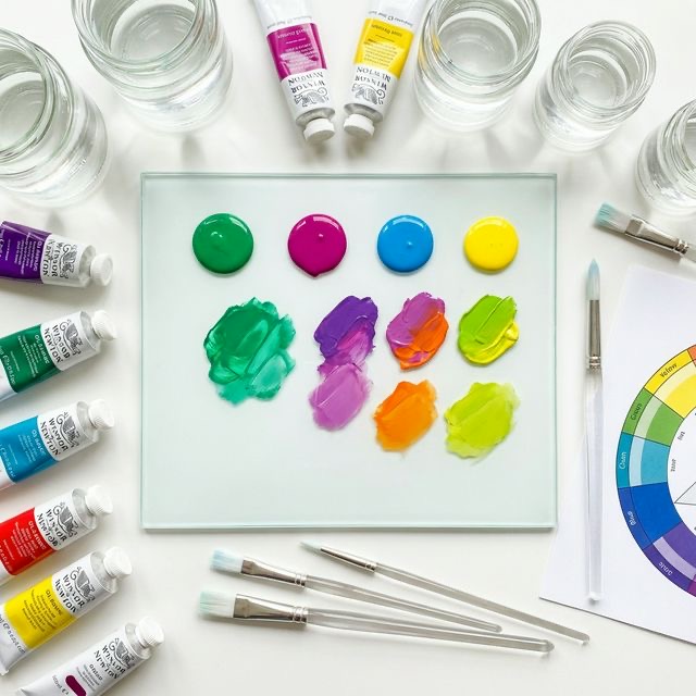
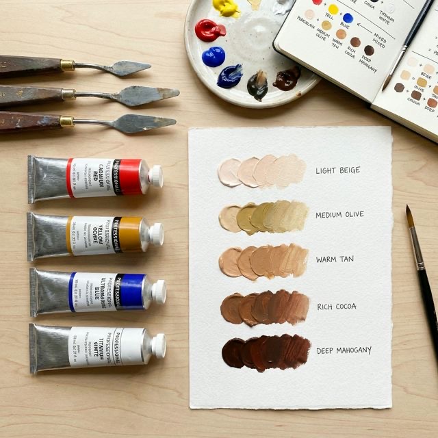
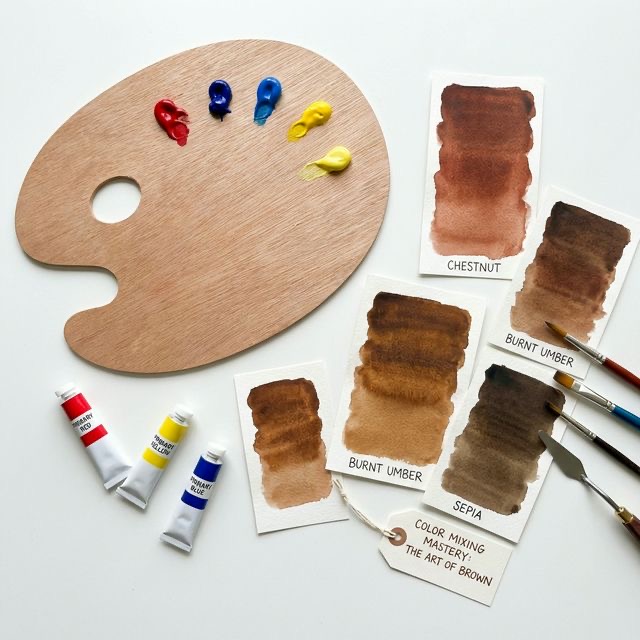
    Every beginner painter has experienced this exact heartbreak: You squeeze out a beautiful puddle of bright blue paint, and right next to it, a beautiful puddle of bright yellow. You mix them together, expecting to see a brilliant, glowing emerald green. Instead, you get a flat, dull, murky olive sludge.

    In the art world, we call this sludge "mud." It is the most common frustration for beginner painters and crafters.

    So, what went wrong? Why didn't your blue and yellow make a bright green? The answer lies in a hidden scientific rule called "Color Bias." Once you understand how color bias works, you will completely eliminate mud from your palette, unlocking the ability to mix incredibly bright, vibrant, jewel-toned colors every single time.

  • Posted on
    Creating Skin Tones: A Color Mixing Guide

    Painting a realistic human portrait is often considered the ultimate test of an artist's ability. Beyond capturing the correct proportions of the face, the hardest part of portraiture is undeniably mixing the perfect skin tone.

    Many beginners try to take shortcuts by mixing white paint with orange, or worse, buying a tube of pre-mixed "flesh tint." These shortcuts almost always result in portraits that look chalky, plastic, or completely lifeless.

    The truth is, human skin is incredibly complex. It is translucent, entirely unique to the individual, and constantly reflecting the colors around it. However, the foundational rules for mixing realistic skin tones are surprisingly simple. Regardless of whether you are painting deep mahogany or pale ivory, the formula is exactly the same. Let’s dive into the ultimate color mixing guide for creating realistic, beautiful skin tones.

  • Posted on
    How to Mix the Perfect Brown Every Time

    If you walk into any craft or art supply store, you will see dozens of tubes with names like "Burnt Umber," "Raw Sienna," and "Van Dyke Brown." While it is incredibly convenient to buy these pre-mixed paints, relying on them completely is one of the biggest mistakes a beginner artist can make.

    When you buy a tube of brown paint, you are stuck with that exact shade. But if you learn how to mix your own browns from scratch, you unlock the ability to create thousands of highly nuanced, perfectly matched earth tones.

    Mixing brown is often a source of frustration for beginners, usually resulting in a muddy, lifeless grey sludge. But there is a very simple, scientific formula behind it. Today, we are going to demystify the color wheel and learn the foolproof method for mixing the perfect brown every single time.

  • Posted on
    Neutral Colors: The Unsung Heroes of Craft Design

    When we talk about color psychology, the conversation is almost always dominated by the brightest hues on the wheel. We talk about the fiery passion of red, the sunny optimism of yellow, and the profound calm of blue.

    However, there is an entire category of color that quietly does the heavy lifting in almost every successful craft project, painting, and interior design scheme in the world: the neutrals.

    Colors like beige, taupe, cream, grey, and greige may not shout for attention, but they are the essential glue that holds the design universe together. Without them, our colorful projects would be visually exhausting and chaotic. Let’s explore the quiet, grounding psychology of neutral colors, and learn why they are truly the unsung heroes of craft design.

  • Posted on
    The Power of Black and White in Modern Crafting

    When we talk about "color palettes" in crafting, we usually think of bright blues, warm oranges, or soft pinks. But what happens when you remove hue entirely? What happens when you strip your project down to nothing but pure black and pure white?

    Far from being boring or clinical, black and white is arguably the most powerful, dramatic color combination in the world of design. It is the ultimate expression of contrast. By removing the distraction of colorful hues, a black-and-white palette forces the viewer to focus entirely on texture, shape, and composition.

    Whether you are designing a modern living room, knitting a graphic sweater, or attempting minimalist painting, mastering black and white will elevate your work to a massive level of sophistication. Let’s explore the striking psychology behind this extreme palette and learn how to use it in your modern crafts.

  • Posted on
    Pretty in Pink: Soft and Bold Approaches to Crafting

    For many years, the color pink has been unfairly typecast. In modern Western culture, it has been heavily restricted to a single demographic: young girls. Consequently, many adult crafters, artists, and interior decorators intentionally avoid the color, fearing it will make their work look childish, overly sweet, or unserious.

    However, writing off the entire color pink is a massive mistake. Pink is one of the most versatile, complex, and emotionally powerful colors you can use. Depending entirely on the specific shade and how you pair it, pink can be either the softest, most innocent color in your toolbox, or the most rebellious, high-energy punch you can throw.

    Let’s unpack the fascinating psychology behind this misunderstood color, and learn how to master both the soft and bold approaches to crafting with pink.

  • Posted on
    Using Orange to Spark Creativity and Enthusiasm

    Have you ever walked down the craft aisle, felt extremely uninspired, and then suddenly had an idea pop into your head when you spotted a bright, neon skein of yarn? It might sound like a coincidence, but if that yarn was orange, it was pure science at work.

    Of all the colors on the wheel, orange has the most unique relationship with the human imagination. While blue calms us down and red speeds up our heart rate, orange holds the very specific power to stimulate our creativity.

    Whether you are painting a canvas, decorating an office space, or simply trying to break out of a creative block, the color orange is an incredible tool. Let’s dive into why our brains love this citrusy hue, and learn how to use it to spark massive enthusiasm in your next DIY project.

  • Posted on
    The Mystery of Purple: Creating Elegant DIY Decor

    Of all the colors on the traditional color wheel, none is quite as mysterious, misunderstood, or majestic as the color purple. It does not exist as frequently in nature as the sprawling greens and blues. It doesn't scream with the biological urgency of red or the pure joy of yellow. Instead, purple exists quietly in the shadows—in twilight skies, in the petals of rare orchids, and in the depths of amethyst crystals.

    Because it is relatively rare in the natural world, human history and modern psychology have assigned purple a very specific, elevated status. It is the color of luxury, spirituality, and boundless imagination.

    Whether you love it or hate it, there is no denying the power of purple. If you want to elevate your crafting projects from "homemade" to "high-end," understanding the psychology of purple is essential. Let’s dive into the regal history of this fascinating color and learn how to use it to create elegant DIY decor.

  • Posted on
    Earthy Greens: Bringing Nature Indoors Through Art

    Have you ever noticed how a simple walk through a forest or a park can instantly clear your mind and lower your stress levels? There is a Japanese practice called Shinrin-yoku, or "forest bathing," which involves simply spending time surrounded by trees to improve physical and mental health. But what if you could not make it to the forest? What if you could bring the healing power of the forest directly to your crafting table?

    The secret to forest bathing is not just the fresh air; it is the overwhelming presence of the color green. Green is the most abundant color in the natural world. It is the color of life, renewal, and steady growth. By intentionally incorporating earthy greens into your DIY projects, you can trick your brain into feeling the same peace and vitality that you experience outdoors.

    Let’s dig into the earthy psychology of green and explore how you can use nature-inspired palettes to breathe fresh life into your art.

  • Posted on
    Sunny Yellows: Invoking Joy in Your DIY Projects

    Think back to the very first time you were handed a box of crayons as a child and asked to draw a picture. Chances are, one of the very first things you did was reach for the bright yellow crayon to draw a smiling sun in the top corner of the page.

    From our earliest memories, human beings associate the color yellow with happiness, warmth, and light. It is the most luminous color on the visible spectrum, meaning it is the color that captures the human eye faster than any other. Because it is so bright and powerful, it is also one of the easiest colors to get wrong in art and design.

    If you want your crafts to radiate positivity, you need to understand the psychology behind this vibrant hue. Let’s explore the uplifting power of yellow, learn why it affects our brains the way it does, and discover how to use it perfectly to inject sunshine into your creative projects.